Fast by design. Not by accident.
A practical guide to building fast, accessible PHP websites

The short answer
Send meaningful HTML first, prioritize the content people came for, and add only the JavaScript that improves the experience. Measure the result on a real phone—not just a perfect lab run.
01. Start with the page, not the framework
A visitor does not arrive to admire your technology stack. They arrive to read an answer, explore your work, or get in touch. A fast website makes that first useful action easy.
For a portfolio, a service page, or a small publication, server-rendered PHP and ordinary HTML can be an excellent starting point. The browser receives readable content immediately. A static HTML page can work just as well when the content does not change per request.
This is not an argument against frameworks. If you need a complex, stateful application, choose tools that support that requirement. The principle is simpler: do not make the browser assemble a basic article if you can send the article directly.
Can someone understand this page and follow its main links before any JavaScript runs? If the answer is no, check whether that dependency is really necessary.
02. Render useful HTML first
Use one descriptive h1, logical subheadings, meaningful links, and actual paragraphs. Put the main content inside a main landmark. For an article, use article, a visible author, and an honest publication date.
PHP templates should escape text at the boundary where it enters HTML. The example below is for a plain-text heading—not a license to insert arbitrary HTML from a form or database.
<?php
$title = 'A small, useful page';
?>
<h1><?= htmlspecialchars(
    $title,
    ENT_QUOTES | ENT_SUBSTITUTE,
    'UTF-8'
) ?></h1>
Keep links as links and actions as buttons. Prefer native elements such as details and summary for a simple disclosure. These choices reduce custom code and provide useful browser behavior without extra work.
03. Give every asset a job
Images and fonts often cost more than the page's HTML. Before adding another library, check whether the largest image is correctly sized and whether you are downloading font weights nobody sees.
- Size images for their display area. Use responsive sources when an image needs different sizes on different screens. Modern formats can help, but compare actual quality and bytes.
- Reserve image space. Set width and height, or a stable aspect ratio, so surrounding text does not jump when the image arrives.
- Do not lazy-load your main above-the-fold image. Lazy loading is useful for images farther down the page. The likely largest contentful element deserves early discovery.
- Keep fonts modest. Serve a small local WOFF2 set when licensing permits. Preload only truly critical files, use a fallback stack, and avoid blocking all text on a font download.
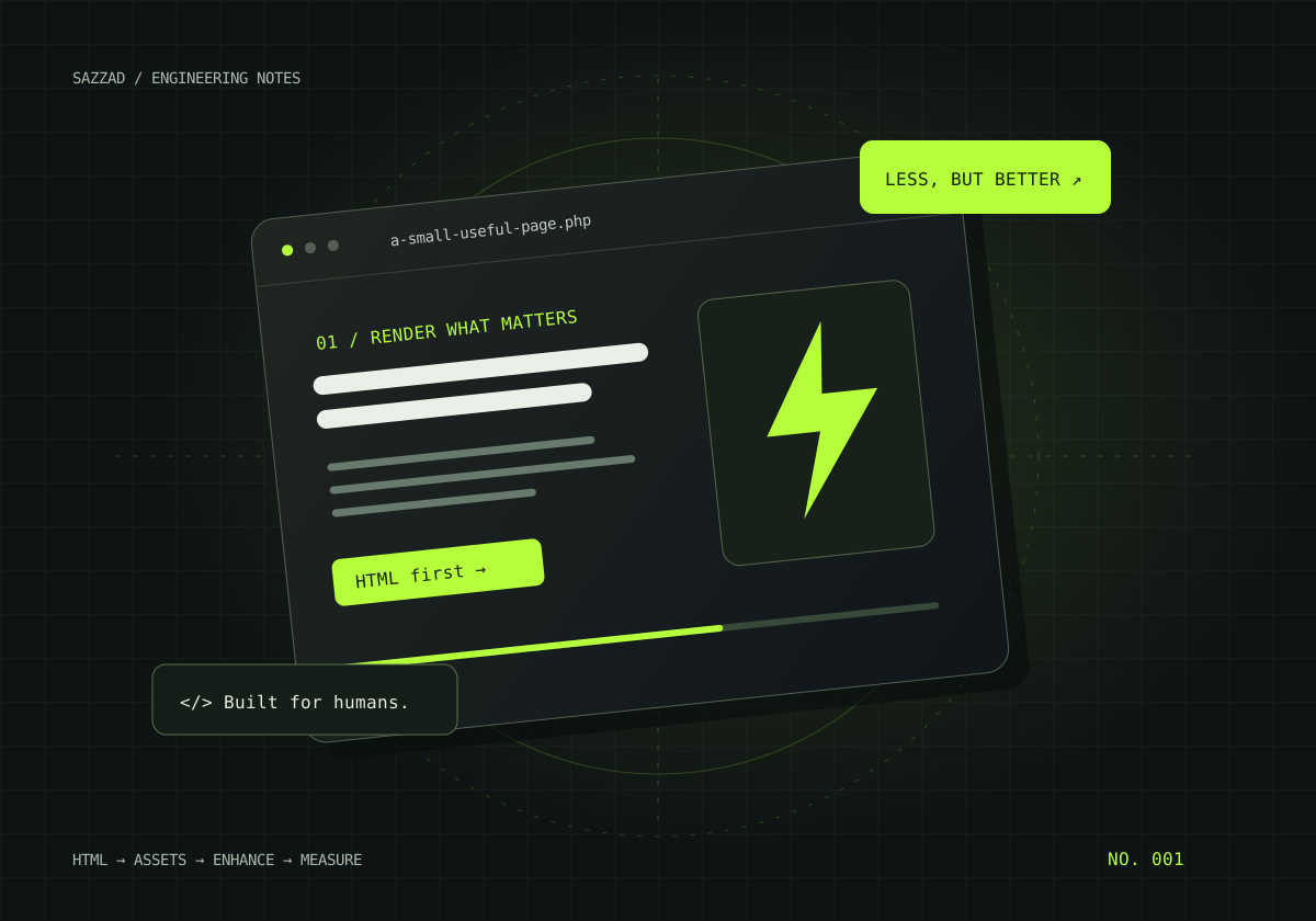
An illustration can also be a compact SVG. For this demo article, the cover is a vector diagram instead of a large stock photo. The alternative text describes the idea; the surrounding article carries the explanation.
04. Make JavaScript earn its place
A table of contents is already useful as a set of anchor links. JavaScript can highlight the current section, but it should not be needed to discover the headings. The same applies to a blog list: the articles should be in the HTML before filtering starts.
Load non-blocking scripts with defer where appropriate. Avoid adding a global animation loop to a page people mainly read. If an interaction can use CSS or a native browser control, start there.
Delayed loading is not automatically better. Loading navigation code only after the first tap may cause that tap to do nothing. Test the first interaction on a slow connection, not just the second click after everything has loaded.
Without JavaScript: readable article, working links, an openable contents list. With JavaScript: optional text-size controls, filtering, a reading-progress indicator, and copy buttons.
05. Treat mobile reading as the default
A layout that technically fits a phone can still be exhausting to read. Avoid full-width walls of tiny text, horizontal page scrolling, and sticky controls that cover half the screen.
Use a comfortable line height, a restrained line length on desktop, and fluid spacing. Keep the article column readable on a large monitor instead of stretching each sentence across the entire screen.
- Make interactive controls large enough to tap comfortably and leave space between them.
- Keep focus indicators visible. Test menus, disclosure controls, and forms with a keyboard.
- Respect reduced-motion preferences, and never rely on animation to reveal essential content.
- Check text contrast in the actual design, including muted text and placeholder text.
- Test zoom and longer text, not just the exact wording in a design mockup.
For this site, checking widths such as 440, 560, 678, 912, and 1200 pixels is useful. They are checkpoints, not separate devices to design for. A fluid layout must also behave well between them and on narrower screens.
06. Measure the experience, not just a score
Lighthouse is a useful diagnostic tool. Its result depends on the test environment, the device simulation, the network, and the page's current state. A single perfect run is not a guarantee that every visitor has a perfect experience.
Core Web Vitals focus on loading, responsiveness, and visual stability. Google's documented “good” thresholds are summarized below. For field assessment, evaluate the 75th percentile of real visits, separately for mobile and desktop where data is available.
| Metric | What it describes | Good threshold |
|---|---|---|
| LCP | Loading of the largest visible content element | ≤ 2.5 seconds |
| INP | Responsiveness to user interactions | ≤ 200 milliseconds |
| CLS | Unexpected layout shifts | ≤ 0.1 |
See the official Web Vitals guide for the definitions and assessment method. Use lab tests to find problems; use field data, when available, to understand what visitors actually experience.
Before and after a change, use the same testing setup. Record the change, compare several runs, and investigate regressions in the browser's network and performance tools. Do not remove accessibility or useful content just to improve a number.
07. Make the answer easy to find
Search engines and answer systems need understandable, trustworthy content. Start with a concise answer, then explain your reasoning, show practical examples, and link to reliable references. Make the author and dates visible.
Give each page a descriptive title, useful description, stable canonical URL, and internal links that help people move to related work. Structured data should describe what is actually on the page. For an article, that can include its headline, author, dates, image, and main page URL.
“Answer-engine optimization” and “generative-engine optimization” are useful ways to think about clarity and discoverability, not a secret ranking formula. There is no special schema that guarantees a citation in an AI answer. Google also explains that its AI search features do not require special optimization beyond established SEO practices.
Avoid hidden keyword blocks, invented reviews, fake expertise claims, and automatically changing the “updated” date without making a meaningful edit. Help the reader first. Search presentation is a consequence of useful, accurately described content—not a substitute for it.
08. A small checklist before you ship
- Open the page without JavaScript. Confirm the main content and links still work.
- Test the first menu tap, keyboard navigation, and form validation.
- Look for missing assets, unnecessary requests, and console errors.
- Check a narrow phone, a tablet-sized viewport, and a wide desktop. Try zooming in.
- Verify the canonical URL and structured data against the visible article.
- Run repeatable performance checks, note the environment, and keep the results.
- Deploy carefully, then check the real server's caching, compression, and error responses.
The best optimization is often a smaller, clearer page. Ship the useful thing first, measure it honestly, and add complexity only when it solves a real problem.
References & further reading
Primary documentation to continue from. These are references for the guidance, not claims that this demo was endorsed by their publishers.
- web.dev — Web VitalsMetric definitions and reference thresholds.
- MDN — Web performanceBrowser loading and practical optimization concepts.
- W3C WAI — Introduction to web accessibilityAccessible experiences and the people they support.
- Google Search Central — Article structured dataHow to describe an article accurately.
- Google Search Central — AI features and your websiteGuidance for AI-powered search experiences.
- PHP manual — htmlspecialcharsEscaping text for HTML output.